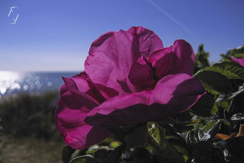
Trying today to incorporate my logo without getting a huge watermark, and testing it on various backgrounds.
As well as sneaking up on my intent for my homeschooling, loafing around in Photoshop, while not exactly studying it. But I will. Equal measures of play and reading is a good mix I think.
MotherOwl says the font is quite how she sees me as a person, so perhaps I’ll stick with it. But I suddenly began to wonder why I’d made the first C a capital letter, since it’s a URL. So now I’ll have to go check whether it looks better all lowercase.
I wish this was a really cool tutorial about creating your online persona with a perfect logo and brand, but I’m just little old me fiddling with a new watermark for my photos.
Because yes, I do think some of them are good enough that I want the credit, and because I want to use a Photoshop action rather than the usual brush made from my logo.
I love my logo, I’ve used it since 1999, but a. the brush is very small and easy to overlook or erase, b. it does not clue anybody in to where the image originated and c. I seem to not always be able to make a crisp, steady click with my brush, whether cats in my lap or not.
There are a multitude of issues involved in watermarking. I personally dislike the gigantic copyright messages obscuring most of the photo. I’ve done it, and well, as you’ve seen I stopped quite a long time ago. Instead of doing the brush click in a corner, I’ve done it all over the photo, finding a critical place that didn’t look too bad with a symbol on it but also visible and harder to crop out. (I won’t go into details about being “invited” to sporting events to take photos for the participants, only to have everybody print out the watermarked samples instead, let’s just say I don’t do those “jobs” anymore).
And fonts. I used to have a font that I used for everything, letterheads, website etc. And well, I just don’t like it all that much now, but I’m having a really hard time picking a new one! Newspaper fonts are too boring, but I also don’t want to use one that resembles the Comic sans style. Not too many flourishes, it’s not a wedding cake blog after all. Do I really have to make my own font? There’s like a million out there for grabs!
It’s not that I can’t find cool fonts. The question is: which one is really “me”? I like simple, I like grunge, I like calligraphic styles. A watermark for marketing purposes needs to be easy to read, so away with the fantasy fonts.
For now it’s a work in progress, starting with a fairly neutral and boring signature until I get myself sorted. I’d very much appreciate it, if you guys would stop me in my tracks if you see that I’ve found the perfect match but not yet noticed it myself!
This is a thing I’ve decided to do. Not really every day, but rather on the days when I’m too busy, too tired, too distracted or too something else to haul out the serious painting gear and have a go at that. Or any other creative thing for that matter. Such as this week which seems to insist on being slept away mostly, I’m a complete zombie. Lovely weather and all, I’d much rather break in my bicycle! But there’s no forcing it, I’d not be safe in traffic.
I have no idea how many people are running a something-like-this-along, most likely 100’s. But I just set the challenge for myself to feel like I wasn’t missing out on picture creation while I do other things, as well as taking the pressure off making a “real” big painting in case any of that nonsense happens. I may do a search on the topic one of these days, but I’ll be more likely to just sit and browse pretty pictures for hours or days instead of making stuff, so for now I won’t.
I’m also not going to post every day or even regularly, just when I feel like it. This is meant to be a treat for myself, not a competition or an exercise. And sometimes other matters are more pressing or I’m simply having so much fun doing other stuff that I forget. 😉
If you want to -along you’re more than welcome to, and we can do the linky thing and all that, but I refuse to make any rules or schedules, just so you know! Just post your cards and comments – or we can swap!
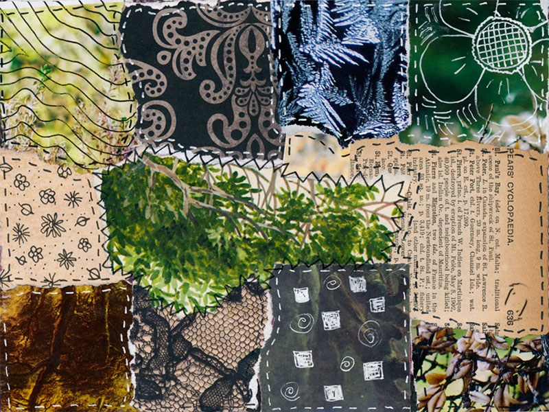
I started out with a piece of watercolour paper that I dipped in my woad vat while testing if it was exhausted or what. It was indeed a wee bit tired (not that I know if a fresh vat would have made more of the paper, I’ll have to test that later), so the next day I dribbled some of the plant watercolours on it, tore it into 4 pieces and had a go with a glue stick because I hated what I’d done with the dribbles. I’m sooo rusty at this collage thing. And I know I should probably stick to one topic rather than trying on all the things I’m rusty at, but it seems I can’t help it. Ok, I haven’t really tried very hard not to, so I don’t know if I could.
I also considered to just copy cat a lot of stuff to keep the flow until I get into it properly, I don’t like to but I hear it’s great for cranking your skills. At the moment, the exercise is primarily about accepting that I make poor choices and that my cards are sometimes useless in the decorative sense. Maybe I’ll have an “ugliest card” competition at the end of the year where you can vote for all the monsters. 😉
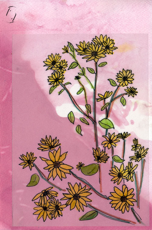
This tiny format is a HUGE challenge for me as well. I want to cram all sorts of things on there, which is impossible. And why postcard and not just “a tiny image a day”? Well, I like to pretend I’m making something useful I think. And I know I’ve framed pretty postcards and put them on the wall, so really, it’s just a name.
Maybe I’ll put old stamps on the back and write pretend messages to and from imaginary people….
Then there’s an entirely different matter. I appear to have developed a slight hand tremor. I can feel it if I try to draw or knit with small needles for instance. Why I have no idea, it doesn’t run in the family that I’m aware. So I guess I should not count on any type of precision work in drawing etc. but have to develop a style where it doesn’t matter. I hope this is it, though, I’d hate to give up making things with my hands. I’ll have to pay attention to how tired I am when it happens. It’s certainly not very good for calligraphy or fine scissor work either! 🙁
Some old pieces of tissue paper with ink. I thought they might be more interesting with some doodles on all that white space, but can I?
Et postkort om dagen
…har jeg tænkt mig at lave som projekt.
Jeg har overhovedet ikke kigget ret meget eller for nylig pÃ¥ de 100-vis af lignende websider man kan finde derude, for sÃ¥ fÃ¥r jeg aldrig løsrevet mig fra at bare sidde og kigge og beundre. Men jeg tænkte jeg kunne bruge det som en slags livline, sÃ¥ jeg føler at jeg trods alt laver noget billedagtigt i de perioder hvor der ikke rigtig er plads til det. Som denne uge der insisterer pÃ¥ at være zombie-sæson, i det gode vejr, hvor jeg hellere ville ud at lufte min cykel lidt. Men jeg ville ikke være trafiksikker, der er ikke noget at gøre…
Ikke noget med at vise dem hver dag eller regelmæssigt, bare når jeg gider. Hvis nogen har lyst til at dele lignende projekter er det super, men der er ingen regler!
Jeg begyndte med et stykke papir som jeg havde dyppet i vaidgryden da den var ved at løbe tør for farve. SÃ¥ driblede jeg lidt andre farver pÃ¥, det blev grimt, sÃ¥ limstiften kom frem…
Det er meget meget længe siden jeg har lavet collager kan jeg godt mærke, og jeg tror aldrig jeg har arbejdet så småt, så det er udfordring på mange planer. Måske jeg går i gang med at kopiere nogen yndlingskunstnere, det siges at være en god måde at forbedre sig på, og så sker der da lidt når min egen fantasi ikke ruller som jeg vil det. Nu må vi se.
Jeg farvede ogs̴ lidt papir i cochenillegryden, og jeg tror jeg hiver mine bladtryk fra sidste ̴r frem ogs̴ og klipper lidt i dem Рeller laver nye.
MÃ¥ske sætter jeg gamle frimærker bagpÃ¥ og skriver fiktive beskeder til og fra ukendte og indbildte personer…
Til gengæld har jeg på det seneste opdaget, at jeg ryster en smule på hænderne. Det er ikke noget der ligger til familien, så jeg kender ikke årsagen, men jeg kan ikke tegne særlig nøjagtigt, og jeg kan mærke det hvis jeg strikker på tynde pinde. Ret irriterende, jeg håber ikke det udvikler sig yderligere, og så må jeg jo bare finde en tegnestil hvor det ikke ses.
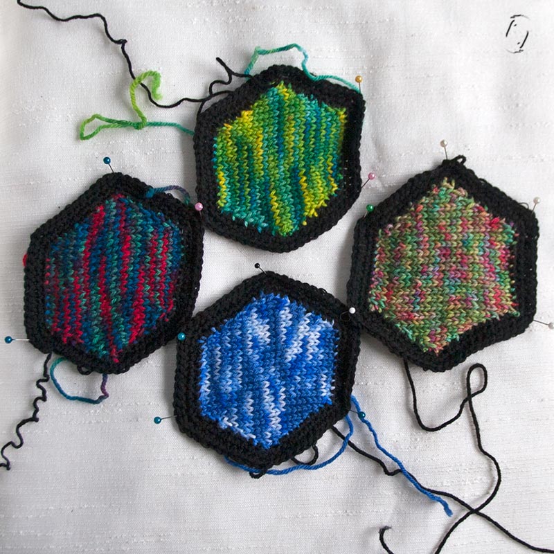
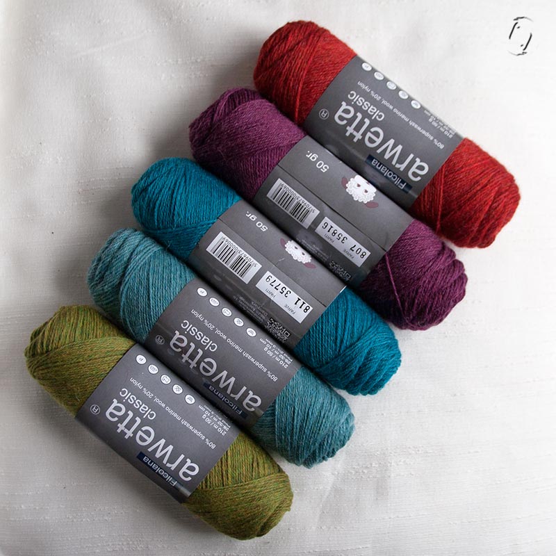
I went to my LYS the other day to ask for the Addi Click Heartstoppers I’d ordered (not there yet) and to get a couple of black skeins of the yarn I’m using for my hexagon blanket, since I’ve now decided on a stained glass effect with the edges. (fwiw, does anyone have a clue why my edges make the hexagons skewed? I count and I count to get the increases at proper intervals, testing 1 more or less stitch when I start, they’re all the same. It’s driving me nuts with this black yarn)
Only this brand has come out with new colours. Sitting on her desk as I was waiting. So I had to take one of each (well, not quite, I left the pink one behind), just so I could keep them to look at. Really, I have no idea what to make of them. They are SW extra fine merino, so technically they are wearable, but they’re also not very elastic so I doubt they’d make a great hat. Shawl-scarf?
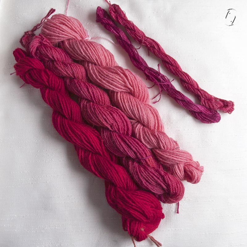
I wanted to test cochineal – which I’ve never used before – over yellow to see if that made orange (it doesn’t), so used a couple of small goldenrod hanks I just dyed. And since my small items scales are wonky, I used far too much cochineal, so I ended up dyeing 3 larger hanks as well as some silk. Whoa! My eyes hurt! I wonder if they’ll turn purple in indigo…. I have a somewhat 20 skein experiment lined up, but that will be later. It’s a grey day today, trust me, the colour is even more vibrant up close and personal!
Farveorgie i pink
Jeg var bare nede i garnbutikken for at spørge til de Addi Click hjertestoppere jeg har bestilt og for at hente lidt sort Arwetta til kanterne på mit hexitæppe. Og så havde hun lige så uskyldigt lagt nye farver frem på sin disk, som jeg var nødt til at tage med hjem! (pånær den i pink) Nej, nej, hun vidste ikke jeg kom, det var helt tilfældigt.
Pink har vi fået nok af denne uge, jeg havde spekuleret på, hvordan gult ville se ud overfarvet med cochenille, bliver det mon orange? (nej, det gør det ikke) Men jeg havde fået vejet for meget af, fordi min mini-vægt er lidt i udu, så jeg endte med at farve 3 fed mere + lidt silke, og det er da lige før man får ondt i øjnene! Jeg spekulerer nu på om de bliver lilla, hvis man overfarver med indigo. Jeg har et større eksperiment linet op med de små biller, men det bliver senere.