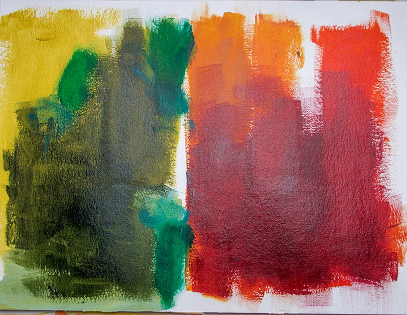
I was just making swatches to check which underpaint colour I wanted for some glazes on different paintings (a green, a red and a blue background series separately), when the colours I’d chosen for this piece of paper happened to please me so much, my thoughts immediately began to run along another tangent.
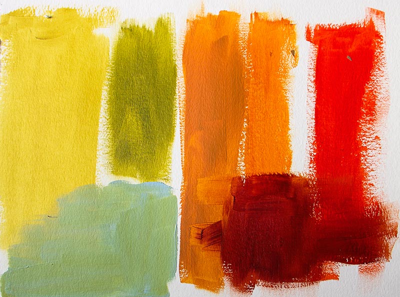
Some abstract landscapy things in this palette perhaps? I was lacking a light cadmium red in my collection for these swatches, so I’ll see if I can blend something from primaries and whether I want to include it, what do you think?
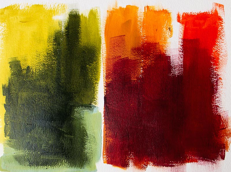
Once I got the overpaint swatches done it all changed again, this collection is far out of my usual zone, but it seems I’ll have to go with it to see what happens on the canvas.